Page 1 of 1

PostPosted: Tue Aug 03, 2010 5:58 pm
by Snowman
Just a heads up to let you know, my website has moved to a new server.
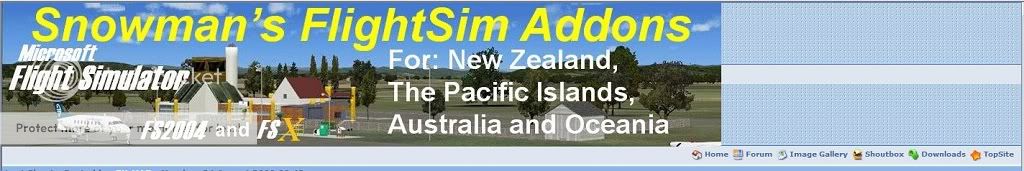
New website addy is......... http://fs-snowman.com/

Something else new, i am now building scenery for BOTH FSX and FS9 !!
I have a number of sceneries for FSX currently under construction, and/or rebuild from FS9 format to FSX .

Lawrie. New_Zealand_etc.gif

PostPosted: Tue Aug 03, 2010 6:21 pm
by Bushmaster
Seems "justhost" is popular, mike also is using this host, and i have saw a number of other websites hosting with "Justhost".
Could you make the navigation bar bigger? it was quite difficult finding it.

PostPosted: Tue Aug 03, 2010 6:29 pm
by ZK-MAT
You are a legend Lawrie, awesome stuff mate. No problems here with navigation. Will catch up with you during the week - was rather hectic last week but have been carrying your stuff around in the car since we spoke lol.

PostPosted: Tue Aug 03, 2010 6:47 pm
by Nzeddy
Snowman wrote:
QUOTE (Snowman @ Aug 3 2010, 05:58 PM) <{POST_SNAPBACK}>
Something else new, i am now building scenery for BOTH FSX and FS9 !!
I have a number of sceneries for FSX currently under construction, and/or rebuild from FS9 format to FSX .

Yay!! This is great news.

PostPosted: Tue Aug 03, 2010 9:32 pm
by Bushmaster
"You might need Glasses as even I can read the "Navigation Bar/Menu" without any problems at all :-)"
I do look at screens a fair lot, but still if you can see it!

PostPosted: Wed Aug 04, 2010 8:58 pm
by markll
So you don't see this, for example:


There are 4 or 5 instances of this, each where the title text has been pushed down out of it's "box" - its definitely a CSS processing thing, and the fs-shipyards one doesn't have the same issue...As I said, I'm running IE8, in standards mode, NOT compatibility mode...

PostPosted: Wed Aug 04, 2010 9:44 pm
by markll
Yeah, that doesn't fix it for me...its definitely something wrong with the CSS - I'd be more specific, but my CSS knowledge is a bit lacking...at work we tend to rely on a specialist in CSS/web site design (who is REALLY REALLY good at what she does too....like award winning good).

The banner on Snowmans site is wierd looking too, BTW:


PostPosted: Wed Aug 04, 2010 10:35 pm
by markll
Sure - the old 80/20 rule right? Or maybe in this case the 500000/1 rule! smile.gif

though I will say that I'm not running at any kind of odd resolution - 1440x900...pretty standard for a 19inch widescreen monitor. And the fs-shipyards site is fine for me too...so SOMETHING is different between them...

PostPosted: Wed Aug 04, 2010 10:57 pm
by ZK-MAT
Lying in bed with my iPod touch and the site looks good on it. No idea what resolution this screen is though!

PostPosted: Thu Aug 05, 2010 4:41 pm
by Snowman
markll wrote:
QUOTE (markll @ Aug 4 2010, 09:44 PM) <{POST_SNAPBACK}>
The banner on Snowmans site is wierd looking too, BTW:


At a res of 1280 x 1024 on my 19" monitor, the banner fills the entire space across the top of the page above the navigation bar.
Using Win XP SP-3 and IE8 with all current updates, i have no problems with anything.

Lawrie. New_Zealand_etc.gif

PostPosted: Fri Aug 06, 2010 9:29 pm
by markll
Snowman wrote:
QUOTE (Snowman @ Aug 5 2010, 04:41 PM) <{POST_SNAPBACK}>
At a res of 1280 x 1024 on my 19" monitor, the banner fills the entire space across the top of the page above the navigation bar.
Using Win XP SP-3 and IE8 with all current updates, i have no problems with anything.

Lawrie. New_Zealand_etc.gif


LOL - its all sorted now...no sign of the extraneous "screen turd" to the right of the banner in my last screenshot...menu titles are sorted now too...